Questions About Layout Design
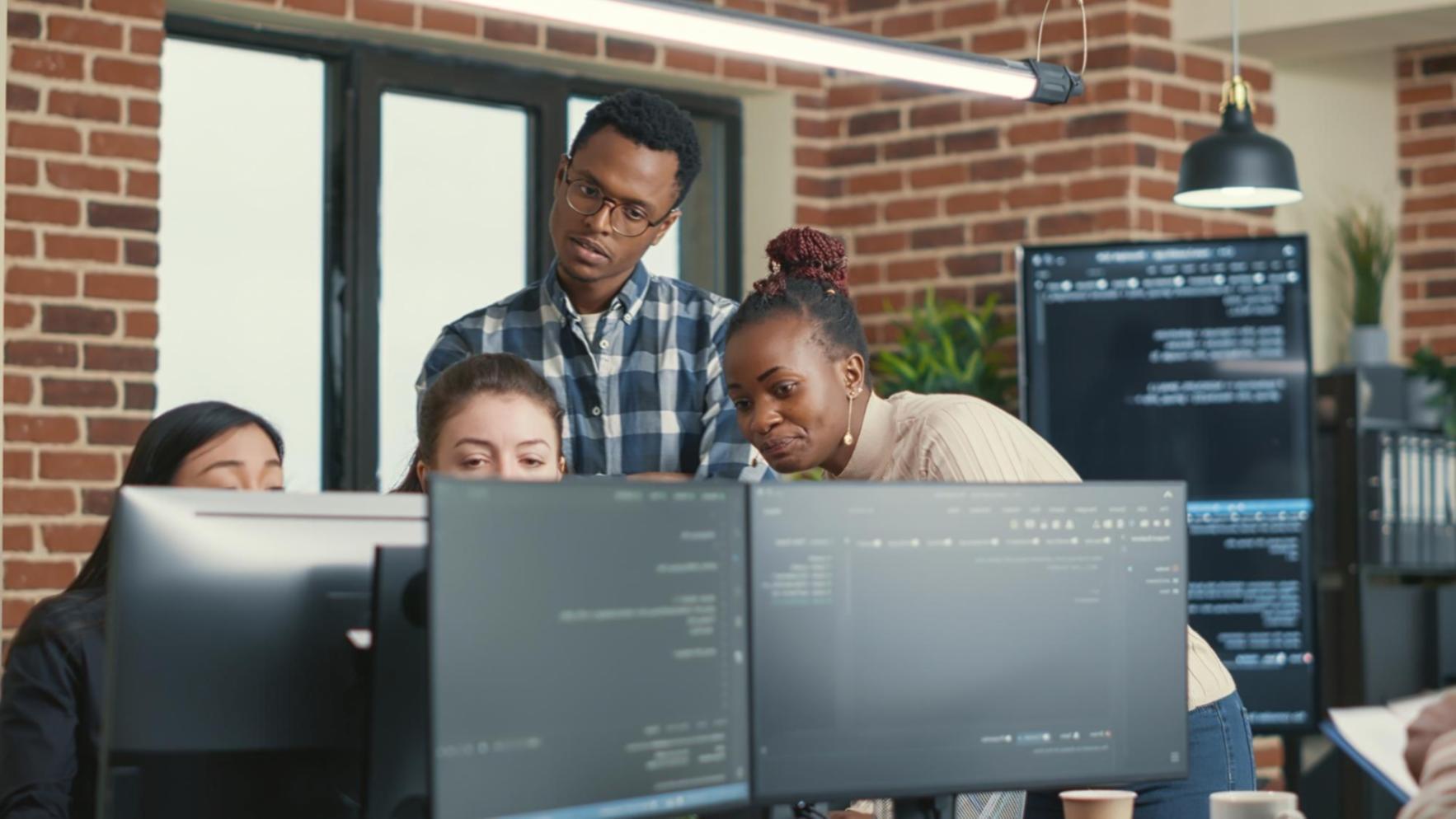
We've been teaching web layout principles since 2019. Here are the questions that come up most often when people start thinking about structure, spacing, and how pages actually work.

Real Questions From Real People
Every October, we run an open workshop in Sheffield where aspiring designers ask us everything. Some questions are technical, some are conceptual. A few catch us off guard.
But most of them? They're the same ones we asked ourselves years ago when we were figuring this stuff out. The answers aren't always straightforward — but they're honest.
What People Actually Want To Know
These aren't polished marketing answers. They're what we tell students in January when they're stuck on a project at 11pm.
How do I know if my layout actually works?
Test it on your phone first. Then ask someone who's never seen it before. If they can find what they need without asking you questions, you're probably close. Real validation comes from watching people use it — not from looking at it yourself for the hundredth time.
Why does my design look fine on desktop but broken on mobile?
Because you designed for desktop first. Start mobile instead. It forces you to prioritize what actually matters. Adding complexity for larger screens is easier than removing it when you run out of space.
Should I follow current design trends?
Follow principles, not trends. Trends change every year. Good hierarchy, readable text, and clear navigation? Those don't go out of style. Look at websites from 2018 that still feel modern — they nailed the basics.
How much whitespace is too much?
When your page feels empty or disconnected. Whitespace should guide attention, not create awkward gaps. If elements feel unrelated, tighten them up. If they feel cramped, give them room. It's more about rhythm than rules.
What's the difference between grid and flexbox?
Grid is for two-dimensional layouts — when you need control over rows and columns together. Flexbox handles one direction at a time. Most real projects use both. Start with what makes sense for each specific component.
When should I break out of the container?
When you want to create emphasis or visual interest. Full-width images, background sections, or hero areas. But bring content back into a readable measure for text — nobody wants to read lines that stretch across a 27-inch monitor.

What We Focus On In Our Programme
- Understanding how content flows naturally and why fighting it usually makes things worse
- Building layouts that adapt without breaking when screens change size
- Learning when to use specific techniques and when simpler approaches work better
- Making decisions based on content needs rather than what looks trendy
- Recognizing patterns in well-designed sites and understanding why they work
- Getting comfortable with iteration because first attempts rarely nail it

Siobhan Kenworthy
Lead Instructor
Students often expect there's a perfect formula they're missing. But good layout is more like cooking than chemistry. You learn techniques, understand ingredients, then adapt based on what you're actually making. The programme starting September 2025 gives people time to practice this until it becomes second nature. That's when it clicks.
Still Have Questions?
We'd rather answer them now than have you wonder later. Our next intake begins in September 2025, but we're talking to prospective students throughout the year.